Category: Design

  • Color: Its characteristics and research

    Color: Its characteristics and research

    Color is one of the most captivating aspects of our sensory experience. It is not only an aesthetic tool in design, fashion, art, and nature but also plays an important role in how we perceive the world around us.

    Throughout history, the study of color has evolved significantly through scientific research. These studies have uncovered the complex mechanisms behind the generation and perception of color.

    What is Color?

    Simply put, color is a visual perception created when objects interact with light. It is the result of how objects either reflect or emit light, and how that light is absorbed or reflected by our retinas.

    Color

    Color is not inherent to objects; it depends on how our eyes interpret the wavelengths of light.

    According to research conducted by Isaac Newton in 1666, white light, such as sunlight, is a mixture of different wavelengths corresponding to the colors of the visible spectrum. In the 19th century, scientists like Thomas Young and Hermann von Helmholtz expanded on these concepts and proposed the theory of trichromatic vision, which shows that humans perceive color through three types of cone cells in the retina that react to different wavelengths of light: red, green, and blue.

    Characteristics of Color

    Color has several characteristics that determine how we perceive it:

    1. Hue (or tone): The basic property that defines colors as red, blue, green, etc. This is related to the wavelength of light. For instance, shorter wavelengths correspond to blue or purple colors, while longer wavelengths correspond to red or orange colors.
    2. Saturation: The intensity or purity of the color. High saturation colors appear vibrant, while low saturation colors appear muted or grayish.
    3. Brightness (or luminance): The amount of light reflected by the color. Brighter colors have high luminance, while darker colors have low luminance.
    4. Value: The lightness or darkness of a color. Adding white lightens the color, and adding black darkens it.
    5. Chroma: Related to the purity of a color, determined by its mixture with primary or secondary colors.

    How We Perceive Color

    Color perception is a complex process that involves both the physics of light and the biology of the human eye. When light hits an object, certain wavelengths are reflected based on the object’s properties (such as texture and composition). These light stimuli are received by the cone cells in the retina and then sent to the brain, where they are interpreted as color.

    Research by James Clerk Maxwell in the 19th century and later by Hermann von Helmholtz helped establish the idea that light can be broken down into different colors, and these are perceived by the human retina in distinct patterns.

    In recent years, devices like displays and digital cameras have mimicked this process, interpreting light wavelengths and converting them into the colors we perceive.

    However, color perception is also influenced by subjective and cultural factors. John DeRayney (2009) argued that the perception of color can vary depending on emotional, cultural, and even psychological factors, meaning that the same color might be interpreted differently in different contexts.

    For example, red might symbolize passion or warning in some cultures, while in others, it might represent good luck.

    The Science of Color

    Colors Perceived in the Real World

    Key Studies

    In 1873, physicist Helmholtz defined the trichromatic theory, showing that the perception of color is related to the three types of cone cells in the retina. This laid the foundation for color perception research.

    Wald & McNichol (1960) measured how the cones in the eye react to different wavelengths of light and uncovered specific patterns in color perception.

    Furthermore, Simon Simon‘s studies on “color sense” explored how color impacts emotional states, revealing the psychological effects that color has on us.

    Conclusion

    Comprender la percepción y el reconocimiento del color es un elemento importante que abarca la ciencia, la psicología y la cultura. El color influye profundamente en nuestros sentidos y puede provocar cambios emocionales y cognitivos significativos.

    Comprender cómo usar el color y su fundamento científico es esencial en campos como el diseño, el arte y la vida cotidiana.

  • What is Design UX/UI? A Complete Guide To

    In today’s digital world, user experience and user interface play key roles in the creation of products and services online. In this article, we will explore what is the UX design/UI, its origin, approach, benefits and the most effective tools for designing interfaces amazing.

    What is Design UX/UI?

    UX design (User Experience)

    UX, or User Experiencerefers to how a user interacts with a product or service, especially in the digital realm. The UX design is focused on improving the user experience by making the interaction to be efficient, pleasant and free of frustrations. This covers the whole process from the research of the user until the prototyping and the final testing of the product.

    Example: Imagine a shopping app online. A good UX design will ensure that users can find and buy products with ease, without facing problems such as buttons, hard to find or a payment process confusing.

    Design UI (User Interface)

    UI, or User Interface, refers to the visual appearance and the interaction the user has with the product. The design UI focuses on the arrangement of the elements on the screen, the colors, the fonts and buttons. The goal is to create an interface that is not only aesthetically pleasing, but also functional and coherent.

    Example: Following the example of the shopping app, design UI would be that the buttons are visible, the images of the products are clear and the color scheme is attractive and easy to read.

    Origin and Approach to Design UX/UI

    How was Born the Design UX/UI

    The concept of User Experience Design (UX) was coined by Don Norman in the early 1990s. Norman, a researcher in design and cognition, introduced the term to describe how product design affects the way in which users interact with and perceive those products. In this sense, UX focuses on creating a smooth experience and the satisfaction of the user.

    On the other hand, the Design UI has evolved over time along with the technology. Initially, it focused on the basic visual elements. However, with the arrival of mobile devices and the rise of the web, it has become a discipline complex that combines both aesthetics and functionality. In fact, today, the design IU encompasses a wide range of aspects that go beyond the merely visual, integrating interactive elements that enhance the overall user experience.

    Approach to Design UX/UI

    The approach to design UX/UI is to create products that are intuitive and easy to use, while also being visually appealing. The design process includes:

    1. Research of the User: Understanding the needs and behaviors of the user.
    2. Wireframing and Prototyping: Creating sketches and models of the interface to test ideas.
    3. Visual design: Apply elements graphics to make the interface attractive.
    4. Testing and Feedback: to Assess the product with real users and make adjustments based on your comments.

    Benefits of implementing the Design UX/UI

    Improving the User Experience

    A good design UX/UI ensures that users have a seamless experience and without problems when interacting with a product. This can increase user satisfaction, reduce the rate of abandonment and foster customer loyalty.

    Increases the Efficiency and Usability

    Design UX/UI well executed makes it easy for users to complete their tasks efficiently. An intuitive design reduces the time required to perform actions and minimizes errors.

    Strengthens the Brand Identity

    A design UI is consistent and aesthetically pleasing reinforces the brand identity and creates a positive impression on the users. The consistency in the design helps to build a brand image with professional and reliable.

    Tools for Designers, UX/UI

    Tools for UX Design

    1. Figma: a Tool for collaborative design in the cloud that allows you to create prototypes interactive and collaborate in real-time.
    2. Sketch: Popular with designers of interfaces for prototyping and designing UI elements.
    3. Adobe XD: Provides tools for designing and prototyping interfaces with a seamless integration with other products of Adobe.

    Tools to Design UI

    1. Adobe Illustrator: Ideal for creating vector graphics and visuals of high quality.
    2. InVision: Allows for the creation of prototypes, interactive, and collaborative design.
    3. Balsamiq: Excellent for wireframing, offering a rapid and simple approach to create sketches of the interface.

    Responsibilities of a UX Designer/UI

    Main Tasks

    1. Research of the User: Conduct studies to understand the needs, behaviors and frustrations of the users.
    2. Development of People and Scenarios: Create user profiles (people) and scenarios to guide the design.
    3. Wireframing and Prototyping: Developing wireframes and prototypes to view and test the interfaces.
    4. Visual design: Design the graphic elements like buttons, icons, and layouts.
    5. Conducting Usability Tests: Run tests with users to identify and solve design problems.
    6. Collaboration with cross Functional Teams: Working with developers, researchers, and other designers to ensure the consistency of the product.

    Skills Needed to Designers, UX/UI

    Techniques

    1. Research and Analysis of Users: the Ability to perform research and analysis of data for the user to understand.
    2. Prototyping and Wireframing: the Ability to create wireframes and prototypes for interactive representing design ideas.
    3. Visual design: Knowledge of principles of graphic design, such as color theory, typography, and composition.
    4. Design tools: Domain tools such as Figma, Sketch, Adobe XD and tools prototyping.

    Soft Skills

    1. Critical thinking and problem solving: Ability to identify problems and develop creative solutions.
    2. Communication: Ability to communicate design ideas effectively to different stakeholders.
    3. Collaboration: Ability to work well in a team with developers and other designers.
    4. Empathy: Understand and anticipate the needs and emotions of the users for designing meaningful experiences.

    How does the design UX/UI in the success of a digital product?

    Design UX/UI can determine the success of a product by improving the usability, accessibility and user satisfaction. A well-executed design facilitates interaction and may increase the retention and loyalty of users.

    The Conclusion about the design UX/UI

    Design UX/UI is a discipline that is crucial for developing digital products that are both functional and visually attractive. To understand the responsibilities and necessary skills, and to use the right tools, you can create digital experiences that not only meet the users ‘ expectations, but exceeds them.

  • What are the interactive content and its benefits?

    Interactive content has emerged as a powerful tool to capture the attention and hold the interest of the public. The interactive content , are the elements of communication that allow users to actively participate instead of just consume information passively.

    This type of content includes a variety of formats that invite the audience to interact, explore and get involved, which in turn improves user experience and increases the impact of the message.

    Examples of Interactive Content

    The following examples of interactive content in social networks offer you a glimpse of clear to help you understand how these elements can improve the participation and optimize your marketing strategies as well as content creators.

    Questionnaires and Surveys:

    • What they Are: Tools that allow users to answer questions and get custom results.
    • Benefit: Encourage participation and provide valuable data on the preferences of the audience.
    • Example: A questionnaire to discover what kind of graphic design is best suited to your brand.

    Infographics Interactive:

    • What they Are: visual Representations of data that allow the users to explore different sections or data.
    • Benefit: Make complex information more accessible and attractive.
    • Example: An infographic on the evolution of graphic design that lets you click on different decades to see examples of trends.

    Calculators and Tools of Budget:

    • What they Are: Applications that help users to perform calculations or specific estimates.
    • Benefit: Facilitate decision making by providing personalized results in real-time.
    • Example: A calculator of costs for services of graphic design that estimates the budget according to the needs of the client.

    Interactive Videos:

    • What they Are: Videos that include interactive elements such as buttons and links, that users can click during playback.
    • Benefit: Enhance the involvement of the viewer and allow you to experience more immersive.
    • Example: A tutorial of graphic design where viewers can choose what technique you learn below.

    Games and Simulations:

    • What they Are:a playful Activities that allow users to experience and learn in a fun way.
    • Benefit: Increase the engagement and retention of the information.
    • Example: An online game that simulates the process of creating a graphic design from concept to the final product. Something like Duolingo.

    Interactive content for Social Networks

    The interactive content in social networks such as surveys and publications dynamics, is a key part of the digital marketing strategies that you have seen and with which you might have interacted. This type of content is intended to improve the participation and engagement of users by inviting them to be actively involved with the brand or message.

    When you use interactive elements, not only catch the attention of the followers, but also get valuable data about their preferences and behaviors. Thus, the interactive content not only enriches the experience on social networks, but it also optimizes the impact of the campaigns and digital strategies.

    Here are some ways to integrate them:

    • Polls on Instagram and Twitter:
      • What they Are: quick Questions that allow followers to vote and see the results in real-time.
      • Benefit: Increase participation and provide direct information on the preferences of the audience.
    • Publications of Carousel on Instagram:
      • What they Are: A series of images or videos that users can swipe to explore more content.
      • Benefit: Keep users engaged and allow you to display detailed information in a way that was visually appealing.
    • Stories Interactive on Instagram and Facebook:
      • What they Are: Stories that include surveys, questionnaires, and interactive elements.
      • Benefit: Facilitate the direct interaction and maintain the interest of the followers.

    Benefits

    • Increase the Commitment: To offer a participatory experience, users are more inclined to interact and share content.
    • Improve Retention of Information: The active participation helps users to remember the information better presented.
    • Generate Valuable Data: interactions provide valuable information about the interests and behaviors of the audience.

    The interactive content will not only make your communication more dynamic and attractive, but also allow you to connect with your audience more effectively. By incorporating these elements in your strategy, you can improve the user experience and to obtain more significant results.

  • What are warm colors?

    When we talk about warm colors like red, orange and yellow we must remember that known to transmit energy, joy and warmth posts on the scene, and they usually start with the color yellow to red-violet on the color wheel. Know the psychology of color in order to learn more of the emotions in colors.

    These warm colors in shades convey feelings of enthusiasm and passion which makes them a popular choice in art and design in general. Let’s explore some famous paintings that use these colors, and how they affect the perception in the works.

    Famous Paintings Warm Colors As References

    These are some of the famous paintings that were created by using warm colors, if you’re looking for references, these were some of the most recognized and that they are still highly sought after.

    Warm colors in the painting the Starry Night by Vincent van Gogh

    This iconic painting was created in 1889, it displays a sky of vibrant, full of stars and a small quiet village. The artist Van Gogh uses shades of blue and yellow, but the flashes of bright yellow in the stars and the moon brings a warmth that contrasts with the dark background, as well as the energy of the warm colors reflected the turbulent emotion of the artist making the work resonates with intensity.

    The Cry written by Edvard Munch

    Created in 1893, ‘The Scream’ is a masterpiece that captures the anxiety and the fear of human, warm colors predominate in the sky with shades of orange and red blend in a dramatic way, these intense colors generated a feeling of restlessness and agitation, reflecting the emotional state of the central character. Munch makes the audience to feel the pain and anguish through his use of color.

    The young Ladies of Avignon created by Pablo Picasso

    Painted in 1907, this revolutionary work of Picasso uses warm colors to break with tradition. Hues of pink, orange, and red combine to give life to the figures in the painting, the use of these colours creates a feeling of closeness and vitality to the time that defies the aesthetic standards of the time.

    The Round of Night created by Rembrandt

    In this famous work of 1642, Are used to illuminate the characters in the midst of the darkness with those shades of gold and brown predominate, and in turn highlighting the dress and the expressions of the protagonists. The warm light creates a warm atmosphere and dramatic, emphasizing the action in the scene and leading the viewer to feel the intensity of the moment.

    List of Warm Colors

    These are some of the warm colors that you can try on your projects and not only use the basic, remember that you can make use of hues and shades.

    Warm colors are the main colors

    1. Warm colours that can be used in the Red :
      • Crimson red
      • Fire red
      • Ruby red
      • Orange-red
    2. Warm colours that go out of the color Orange :
      • Bright orange
      • Dark orange
      • Orange burnt
      • Orange coral
    3. These are the warm colors of the color Yellow :
      • Bright yellow
      • Yellow gold
      • Yellow mustard
      • Lemon yellow
    4. The warm colors of the color Pink:
      • Hot pink
      • Fuchsia pink
      • Bubble gum pink
      • Salmon pink
    5. And the Brown :
      • Light brown (beige)
      • Chocolate brown
      • Brown terracotta
      • Copper brown
    6. The color Gold also have your warm colors :
      • Bright gold
      • Pale gold
      • Old gold
    7. Beautiful warm colors of the color Peach :
      • Peach soft
      • Peach clear
    8. Use these warm colors that you can get the color Coral :
      • Light Coral
      • Dark Coral
    9. Lastly, if you were looking for the Terracotta :
      • Terracotta clear
      • Terracotta dark

    Other Warm Colors

    • Coffee
    • Hemp
    • Siena (siena burnt)
    • Brick red
    • Dark red

    Conclusion

    The warm colors are beautiful colors that convey that warmth that you might need our projects, without a doubt, I invite you to experiment with these colors.

  • The Harmony of analogous colors

    The Harmony of analogous colors

    What are analogous colors?

    The analogous colors are those that are next to each other on the color circle. This closeness allows them to share similar hues, creating a sense of cohesion and harmony in any visual project.

    Use analogous colors is an effective strategy for designers and creatives looking to convey emotions, soft, and balanced in their works.

    When do you use analogous colors?

    The analogous colors are ideal for those designs where you want to evoke an atmosphere of tranquility and unity. They are commonly used in:

    1. Graphic design: In the creation of logos, brochures, and posters that need a approach to aesthetic and soft.
    2. Interior decoration: To create child-friendly spaces that invite rest and relaxation.
    3. Fashion: In collections that seek to transmit cohesion and style, using variations of the same color or the colors nearby.
    4. Visual art: Where the fusion of tones analogues can generate depth and continuity.

    The application of analogous colors is especially effective when you are looking to create a sense of flow and movement within a design, avoiding the shock visual that may result from combinations of colors more contrasting.

    Examples of some

    As you can see, these colors tend to be more neutral and subtle in comparison with the complementary colors, which tend to generate a contrast, more vibrant and dynamic.

    This closeness in the colour spectrum allows you to create beautiful compositions.

    Here you have some examples as a reference:

    Green, Yellow-Green and Yellow: This combination is perfect for projects related to nature, evoking freshness and vitality. Ideal for brands of organic or sustainable.

    Blue, Blue-Green and Green: Use these colors together can evoke feelings of calmness and serenity, which makes them ideal for the design of spas or wellness products.

    Red, Red orange and Orange: This warm palette is perfect for transmitting energy and enthusiasm, and often used in marketing campaigns and advertising.

    Tools that will help you to create analogous colors.

    Adobe Color: Adobe Color.

    Coolors: Coolors.

    Canva Color Wheel: Canva Color Wheel.

    Final conclusion

    They are an essential tool in the arsenal of any designer or creator. It will offer you harmony and cohesion to your visual projects is to feel balanced and aesthetically pleasing.

    Whether you’re working on a logo, a collection of fashion or decoration of a space.

  • Three-dimensionality: What it Is and Why it Is So Relevant

    What Is the Three-dimensionality?

    The three-dimensionality describes everything that has three dimensions: height, width, and depth. This concept, which is key to geometry and physics, defines the space we inhabit and how we perceive it.

    In addition, it serves as the basis for multiple applications in areas such as design, technology, and cultural preservation, transforming the way in which we interact with the environment and the information.

    Dimension: the Base of The Space

    In geometric terms, the dimensions determine the minimum number of coordinates needed to locate a point:

    One-dimensional: A straight line requires only one coordinate.

    Two-dimensional: A plane requires a latitude and longitude.Three-dimensional:

    Requires three coordinates: height, width, and depth.

    This framework is the basis for the representation of reality in various fields, from film and video games to digital models of historical heritage.

    The Three-dimensionality in Action

    3D models for Preserving the Heritage.

    The models of three-dimensional are essential for documenting and preserving historical items. Allows you to recreate buildings, to represent spaces missing and hypothesize about its structure.

    In addition, these models combine information from various sources, such as photographs, drawings, and archaeological studies, to achieve reconstructions reliable and useful in research and conservation.

    Cinema and video Games: Transforming the Visual Experience.

    3D cinema using projections stereoscopic to simulate depth, while video games have adopted the 3D since the 90’s, revolutionizing the industry. The three-dimensionality not only improves the visual experience, but also offers creative possibilities how to combine charts in 2D and 3D to achieve unique effects.

    Challenges of 3D: Not Everything is Perfect

    Although the 3D offers immersive experiences, is not without challenges:

    People with visual problems may have difficulties to perceive the depth.

    Long-term exposure can cause eye fatigue or headaches.

    In the digital environment, the conservation of models of three-dimensional is complex, as it requires to maintain technological compatibility over time by using open standards and continuous updates.

    The Impact of three-Dimensional Reality

    Beyond the graphical representation, the 3D transforms key areas:Education: anatomical Models and historical interactive.

    Architecture:- accurate Simulations for planning and design.

    Entertainment: immersive Experiences in games and film.

    A Connection Between the Reality and the Future

    The three-dimensionality is more than a geometric concept: it is a tool that revolutionizes how we perceive and represent the world. From preserving the past to design the future, the 3D opens new possibilities to understand, create, and innovate in all aspects of life.

  • 10 Fonts Minimalist that Every Designer Should Know

    In the world of design, have a selection of fonts minimalist confidence can make the difference between a project rushed and one well executed.

    Save time with these fonts minimalist

    These fonts are not only timeless, but also help to convey clarity and professionalism to any project.

    Whether you need something fast or that you seek to simplify your design, you have these options lists can save you time and improve the quality of your work.

    In this article we present you the 10 fonts minimalist most popular that every designer should have on hand.

    Each of these options is tailored to different types of projects, from branding to digital interfaces, and are perfect for those moments where you need a clean design and very effective.

    Download every typography minimalist

    Below, find out why these sources are essential.

    1. Helvetica

    Helvetica is the queen of minimalism. Its clean design, modern and perfectly balanced makes it suitable for almost any type of project, from logos to signage.

    This font is ideal for companies that are looking for a contemporary look, and professional.

    2. Future

    With its geometric shapes and futuristic structure, the Future is perfect for projects that require a touch of modernity without losing legibility.

    It is commonly used in branding, technology, architecture, and graphic design contemporary.

    3. Avenir

    Avenir is known for its elegance and simplicity. It is ideal for web design projects, mobile apps and all kind of marketing material that you need to convey clarity and professionalism without overloading the viewer.

    4. Montserrat

    This typography has become a standard for many designers because of its versatility and visual appeal. With its modern shapes and clean style, Montserrat, works great in headlines and web sites, in addition to projects that require a strong personality and a minimalist.

    5. Roboto

    Combines geometry with smooth curves, which gives you a touch friendly and professional. It is ideal for user interfaces, mobile apps and longer texts where legibility is the key.

    Its wide range of weights makes it even more adaptable to different needs of design.

    6. Open Sans

    One of the fonts more readable and widely-used, Open Sans is perfect for projects where accessibility and ease of reading is a priority.

    Works well both in print and on digital platforms, especially in long texts.

    7. Gotham

    Gotham is known for its robustness and versatility. It is commonly used in branding and advertising, being perfect for companies that are looking for an understated style and serious but with a modern twist.

    Its excellent readability makes it ideal also for signaling.

    8. Proxima Nova

    With a clear structure and a touch of sophistication, Proxima Nova is a popular option in the web design and the creation of interfaces.

    It is very versatile and works well in digital projects, both on screens small and large.

    9. Lato

    Is a typography humanist with a style that is friendly and warm. Its flexibility makes it ideal for projects that combine aesthetic minimalism with a touch of accessibility and proximity. Perfect for web sites, branding and business presentations.

    10. Drink Neue

    Drink Neue is a font sans-serif with a strong design and geometric. Ideal for titles and logos, this fountain is ideal for projects that require visual presence without losing the simplicity.

    It is perfect for marketing materials, signage, and web sites of visual impact.

    These 10 typefaces minimalist not only offer style and modernity, but they are essential tools for any designer that seeks to convey clarity, simplicity and professionalism.

    Have them in your repertoire will enable you to tackle different types of projects with ease, saving time and effort into each design.

  • Star Oswald: What it is and how to use it properly

    What is the Star of Oswald, and what is it for?

    The Star of Oswald, also known as chromatic circle Oswald, is a fundamental tool in colorimetry, which helps to understand the relationships between colors and its application in different fields, especially in the design, hairdressing and aesthetics.

    Where you can appreciate the colors primary, secondary and tertiary.

    Origin of the star of Oswald

    His origin is based on the theory of the color developed by the German chemist Wilhelm Oswald, who organized the colors in a circular pattern to represent their interaction and harmony.

    This star is divided into 12 segments, each one representing a different tone, allowing you to visualize how the colors complement or contrast each other, something that is very important to keep in mind if or if.

    Its purpose is to facilitate the choice of colour combinations in a balanced and effective, which makes it an indispensable tool in disciplines such as:

    • Colorimetry hair: Determine the shades of hair that are appropriate to the color of skin and eyes.
    • Graphic design and fashion: Creating color palettes, attractive and balanced.
    • Makeup and styling: Select shades that are conducive to each person.
    • Painting and decorating: Define harmonies of color in spaces or illustrations.

    The star of Oswald the difference is in the colour circle traditional because it focuses more on the perception of color and your balance depending on the light and the saturation (Star Oswald)

    How to use the Star of Oswald step-by-step

    If you want to use the Star of Oswald correctly, follow these steps:

    1. Identifies the base color: this Determines what is the tone prevailing in the object, or hair design in which you are going to work.
    2. Look for complementary colors: Located in the star the color opposite to the chosen; these colours create contrast and visual balance.
    3. Use color harmonies: Test combinations as triads (three colors equally spaced), analogous (colors that are close on the wheel) or monochromatic (variations of the same color).
    4. Adapted according to the context: In a hairdressing salon, for example, a warm tone can be balanced with reflections cold as the skin of the person (color Theory)
    5. Performs tests and adjustmentsBefore you apply definitely a color, test how it interacts with the other tones present in the design, hair or makeup.

    Examples of practical use

    • In hair: If hair has a tone orange junk or spam, can be neutralized with a bluish tone as the star of Oswald.
    • In fashion: red dress can be combined with accessories green for achieving an attractive contrast.
    • In graphic design: To transmit serenity, you can choose cool colors in harmony (blue and green).

    The Star of Oswald is a visual guide invaluable for those who work with color, helping to achieve harmonious combinations and functional in different areas.

  • What is the animation and why it is so fascinating?

    Have you ever wondered how they come to life the characters of your favorite movies? The animation is an art and a technique that allows us to create completely new worlds, exciting stories and unforgettable characters, this in the world of video games and video is a bomb. It is a magical way of giving life to things that only exist in our imagination!

    The animation is the art of creating the illusion of movement by a rapid sequence of still images, known as frames . Each frame represents a fraction of the movement that, when played back in a continuous manner, resulting in a fluid animation.

    The number of frames per second ( FPS , for its acronym in English) is a key aspect of this process. For example:

    • 12 FPS: Was the rate used in the first animation classic, enough to transmit motion, although with a certain stiffness.
    • 24 FPS: it Is the standard in most of the animated movies and live-action, since the human eye perceives this rhythm as a natural movement.
    • 60 FPS or more: it Is used in animations and modern video games to experience ultra-smooth, especially in contexts interactive.

    Every second of animation it may require 24 individual frames , which means that a full minute means to 1,440 unique images . This gives you an idea of the immense work behind each project is lively, especially in traditional techniques such as hand drawing, where each frame should be created meticulously.

    In simpler words, the animation makes ideas that static in a dynamic, allowing you to tell stories that break the barriers of time, space, and reality.

    According to Wikipedia , the ‘animation is a technique that gives the feeling of movement to images or static drawings by the continuous projection of these over a period of time.’

    This process, although it seems simple, it is extremely technical and artistic. For example, the animators must take care of details such as the motion tween , the persistence visual of the human eye and the principles of timing and spacing , which determines how an object accelerates or decelerates between frames. Each of these elements contributes to the movement to be compelling and emotionally powerful.

    The animation has deep roots, which go back much farther back than you might imagine.

    The first steps

    The history of animation starts with optical toys of the NINETEENTH century, such as the thaumatrope and the zoetrope, which created the illusion of movement.

    However, it was not until 1908 when it came to what is considered the first animation film: ‘Fantasmagorie’, a short French created by Émile Cohl.

    The golden era of Disney

    In 1928, Walt Disney revolutionized the world with ‘Steamboat Willie’, the first animated short with synchronized sound, featuring the world-famous Mickey Mouse. This was a milestone that marked the beginning of animation as a medium of mass entertainment.

    The digital revolution

    The technological advancement in the last decades completely transformed the animation. In 1995, Pixar released ‘Toy Story’, the first film animated entirely by computer, marking a before and an after in the industry.

    The animation in 2024-2025

    Today, the animation continues to break boundaries. Movies like ‘Spider-Man: Across the Spider-Verse’ (2023) have raised the bar with styles visual innovators who blend traditional techniques and digital. In addition, platforms like Netflix and Disney+ continue to produce animated content of high quality, consolidating the animation as a medium is fundamental in the popular culture.

    The animation is not just a technique; it is a world full of possibilities. Here are the main types:

    1. Traditional animation

    Also known as 2D animation, is the classic technique that consists of drawing each frame by hand. Movies like ‘The little Mermaid’ and ‘The Lion King’ are examples iconic of this style.

    • Advantage: feels handmade and personal.
    • Challenge: it Is extremely labor-intensive; it requires thousands of designs to create a few minutes of action.

    2. Computer animation (CGI)

    It is the most commonly used today. Uses graphics generated by computer to create three-dimensional images. Notable examples are ‘Shrek’ and ‘Frozen’.

    • Advantage: Allows you to create worlds amazingly realistic or completely fantastic.
    • Challenge: Requires advanced knowledge of software and hardware.

    3. Stop motion

    It is based on photographing physical objects, moving them slightly between each shot. Movies like ‘The weird world of Jack’ and ‘Kubo and the search for a samurai’ use this technique.

    • Advantage: Creates a unique effect and handmade.
    • Challenge: it Is very slow, each second can take 24 photos.

    4. Experimental animation

    Explore non-conventional techniques, such as sand, paint, or mixed materials. It is popular in films artistic and independent film festivals.

    The departments behind the magic: essential complements of the animation

    The animation is not only the work of the animators; Behind each project there is a multidisciplinary team that brings their talents to enrich the emotional and visual experience. Some of the key departments include:

    • Visual effects (VFX):
      The visual effects artists are responsible for adding elements such as explosions, particles, fog, water, and other effects that enhance the visual impact of the animation. For example, in a scene of battle, the rays that emit a spell or the destruction of a building tend to be created by this team. Your work ensures that every detail will look spectacular and compelling.
    • Sound effects:
      The sound team creates and edits auditory effects that accompany the animation. From the noise of footsteps in the snow up to the roar of a dragon, the sound effects complement the narrative and enhance the immersion of the viewer. For example, in an animation of science fiction, the ‘hum’ of a spacecraft not only complement the action, but also create a unique atmosphere.
    • Design-music:
      The soundtrack is critical to evoke emotions in the viewer. The composers work closely with the animators to synchronize the music with the key moments, such as scenes emotional or action. A classic example is the music that accompanies Simba ascending the rock of the king in The Lion King , an epic moment that it would not be the same without the musical accompaniment.

    Each department provides its essence, and together they make a animation to be more than images on the move: become a complete sensory experience.

    The importance of the retention of a visual animation.

    The retention visual is the ability of an animation to capture and keep the attention of the viewer, recording in his mind images memorable and emotions. This factor is crucial, especially in a world where the contents are competing fiercely to attract the gaze of the public.

    How is it achieved a high retention visual?

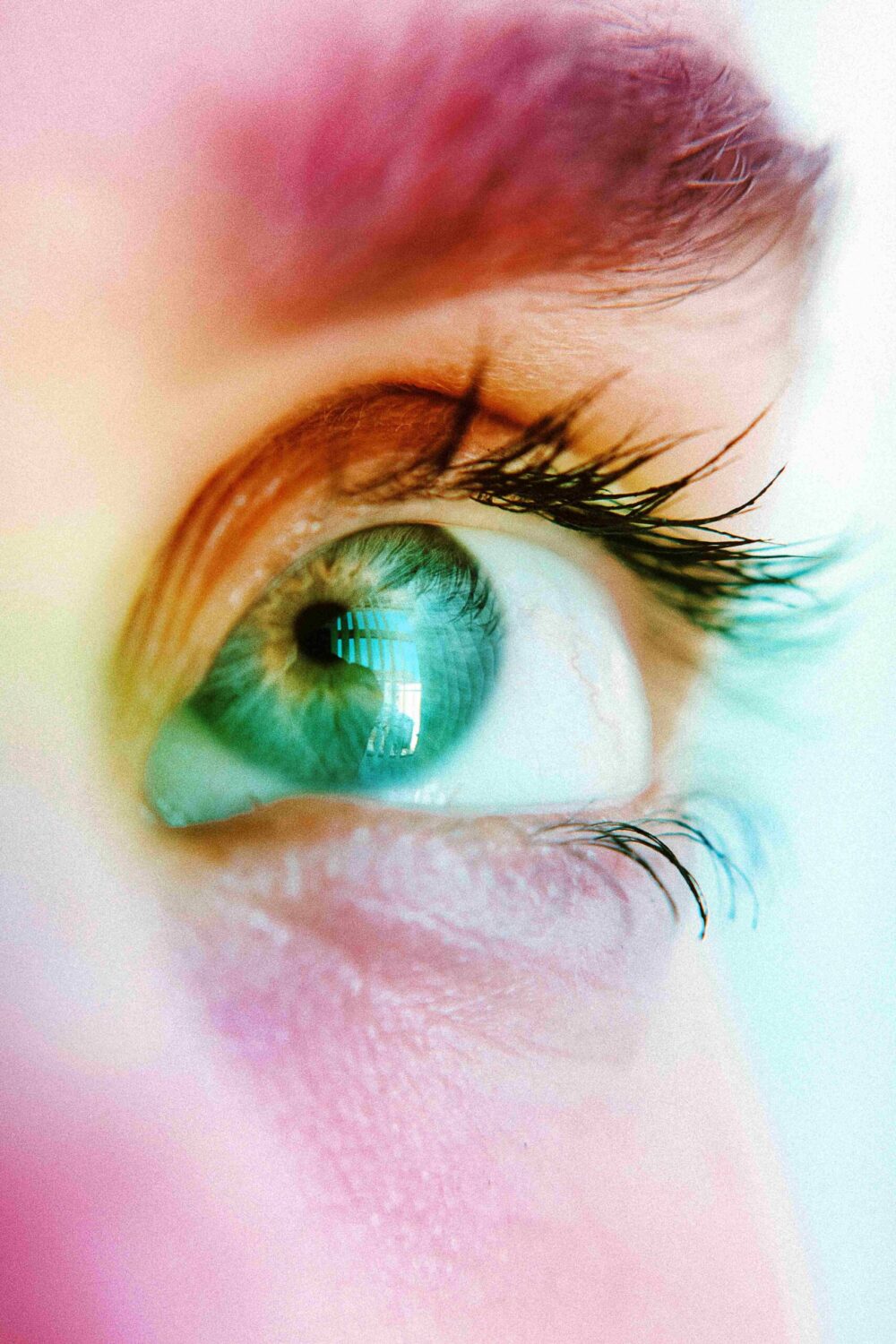
    • Eye-catching designs: The characters and scenarios with vibrant colors and unique shapes highlights and remain recorded in the memory of the viewer.
    • Visual narrative is clear: An animation with flowing movements, sequences are well structured and a focus on details ensures that the public understand and enjoy each and every scene.
    • Synchronization of elements: The combination of sound, music and visual effects must be perfectly synchronized to create an experience of emotionally shocking.

    For example, in the animated Spider-Man: Into the Spider-Verse , the colors, the style of the comic and the sound effects are so well designed that every picture looks like a work of art in itself. This type of animation allows the viewer to remember specific scenes even after the movie has finished.

    The retention visual is not only a question of aesthetics, but of how a story, along with its design and execution, it can resonate deeply in the viewer.

    The animation not only transformed the entertainment industry, but also the way we communicate complex ideas. Thanks to her, we can:

    • Educate: The animation makes it more accessible difficult concepts, as well as in the educational videos.
    • Inspire: Stories such as ‘Up’ or ‘spirited away’ will touch millions.
    • Innovate: From video games to medical simulation, the animation is present in various areas.

    In addition, she broke cultural barriers, making characters from all parts of the world to be recognized and loved globally.

    Creating an animation is a complex process that combines creativity and technology. Here’s a closer look:

    1. Idea and script: it All starts with a story.
    2. Storyboard: create sketches that represent the key scenes.
    3. Design of characters and scenarios: Artists visualize how you will look the elements of the animation.
    4. Animation: produces movement, frame by frame, using specific techniques depending on the style.
    5. Editing and postproduction: add special effects, music, and sound to Polish the final product.

    The animation continues to advance by leaps and bounds. With technologies such as artificial intelligence and augmented reality, the possibilities are endless. Who knows what wonders we will see in 2025!

    If anything is unclear, is that the animation not only allows us to dream, but also to make those dreams come true.

  • What is branding? The truth

    What is branding? Good, is to manage the reputation of the brand in a few words give life visually with the design, but with a management solid strategy on what you want to convey very well planned from the beginning, as well as it shows a brand to the audience, it’s like his face.

    Delving into what is branding

    Branding is a discipline, multi-faceted, therefore, requires the collaboration of several departments within a company to create and maintain a brand identity is consistent and effective. In the first place, the marketing department leads the overall strategy of branding, developing campaigns, messages and materials that, in turn, reinforce the image of the brand in the market.

    Departments are required to develop a branding successful

    Graphic design is responsible for the creation of visual elements such as logos, fonts, and colors, ensuring that all visual aspects of the brand are attractive and consistent. Communication and public relations to manage the public perception of the brand, building relationships with media and public to ensure a positive image.

    The product development department works on the alignment of the branding with the features and benefits of the product, ensuring that the value proposition is communicated effectively.

    Finally, the human resources department plays a crucial role to integrate the culture of the brand within the company, ensuring that employees live and reflect the values of the brand in their daily interactions. Together, these departments work together to build a brand identity is solid and consistent that resonates with consumers and strengthen the company’s position in the market.

    Types of Branding and their examples

    Below you can see a list detailed, but simplified and with examples so you can better understand each of the types of branding that currently exist.

    Branding Corporate

    Description: refers to the branding of the company as a whole. Focuses on building and maintaining an image and positive reputation for the company as a whole, beyond its individual products or services.

    Example: Apple Inc.

    Description: Apple stands out for its focus on innovation, the elegant design and simplicity. Your branding corporate is focused on brand identity strong that conveys quality, sophistication and a modern lifestyle.

    Date: Since its foundation in 1976 until the present day.

    Branding of Product

    Description: This type of branding focuses on creating a specific identity for a particular product. The aim is to highlight the unique characteristics of the product and to create an image that sets you apart from other similar products in the market.

    Example: Coca-Cola

    Description: The branding of Coca-Cola for their drink is iconic, with a logo that is recognizable, a distinctive color (red) and a partnership with happy moments and refreshing. Each advertising campaign and packaging reinforces this image.

    Date: From 1886 to the present.

    Branding Service

    Description: Focused on the services offered by a company instead of physical products. Focuses on the experiences and the value that the service provides to customers.

    Example:Uber

    Description: Uber has created a strong brand identity for your service transport, highlighting the convenience, accessibility and innovation in the urban mobility. Their branding focuses on ease of use and reliability of the service.

    Date: Founded in 2009 and is still evolving.

    Personal Branding

    Description: This type of branding focuses on the creation of an identity and a personal reputation, often used by individuals who wish to excel in their professional fields or creative.

    Example: Oprah Winfrey

    Description: Oprah has built a personal brand solid based on empathy, empowerment, and success in the media. His name and image are associated with values of authenticity and motivation.

    Date: From the 80’s until today.

    Branding Brand (or Branding-Line)

    Description: Involves the creation and management of the identity to a specific line of products under the brand name more widely. It is an identity that is consistent for a number of products that belong to the same category.

    Example: Nike Air Max

    Description: Nike has created a distinctive identity for its line of shoes Air Max, highlighting the damping technology and sporty style. Each model within the line maintains a consistent image, but with specific characteristics.

    Date: Launched in 1987, and continues to develop new versions.

    Branding Experience

    Description: This type of branding focuses on the overall experience that customers have with the brand. Includes all the points of contact and interaction with the brand to create a memorable experience and positive.

    Example: Disney

    Description: Disney offers a brand experience that encompasses theme parks, movies, products, and more. The brand is known for creating unforgettable experiences, and magical to people of all ages. Date: From 1923 to the present.

    What is audio branding?

    ¿Qué es el audio branding?

    It is the practice of using sound elements to build and strengthen the identity of a brand. In the first place, it focuses on the creation and integration of specific sounds, such as jingles, sound effects, or melodies, which are associated uniquely with a brand.

    These items are hearing is for the purpose of improving the recognition of the brand and evoke positive emotions in the consumer.

    Not only limited to commercial radio or television. it also covers the music and sounds used in ads, apps, websites and point of sale.

    The idea is to create a listening experience consistent strengthen the visual identity of the brand and create a connection memorable with the audience.

    What is the study of the branding?

    ¿Qué es el estudio del branding?

    It is a discipline that focuses on analyzing how to build, manage and maintain an effective brand.

    In the first place, the study of the branding investigates the fundamental components that constitute a brand identity, including the creation of visual elements such as logos and color schemes, as well as the development of key messages that resonate with the target audience.

    Overview on what is branding

    The branding is a key skill and a valuable resource for companies. Allows brands to dressing, identify and differentiate yourself in the market. Is manifested both in the digital world as in the real world, and are complemented with advertising and marketing strategies.