When it comes to graphic design and editing, one of the most crucial aspects that is often overlooked is the proper handling of color in our projects, especially when working on projects for print.
Here is where the CMYK color model (Cyan, Magenta, Yellow and Black) and in side becomes vitally important. To understand how this system works and its impact on the final result can be the difference between a terrible job in colors and one that really shines.
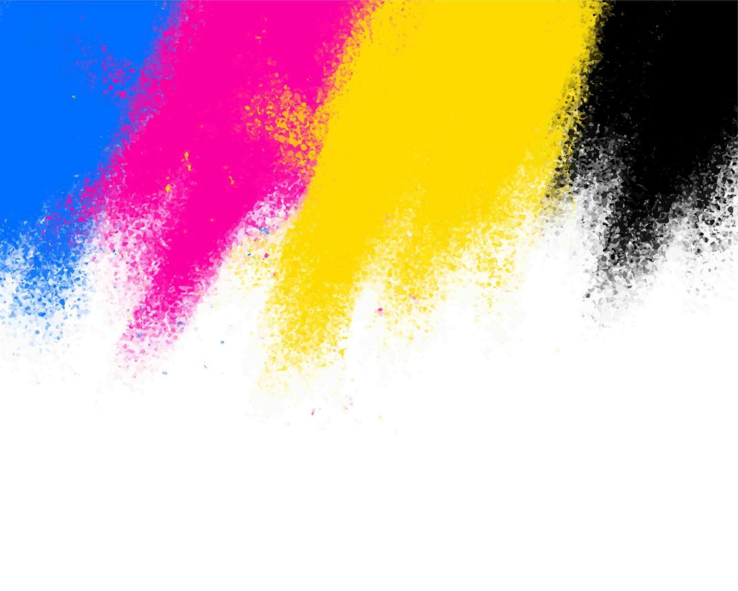
What is CMYK colors in graphic Design?
The colors, CMYK is a subtractive color model that is used mainly in the print. Unlike the RGB model (Red, Green, and Blue), which is additive and is used in digital displays, the colors, CMYK is based on the mix of four basic colors: cyan, magenta, yellow and black.
The combination of these primary colors produces a wide range of tones, allowing the creation of secondary colors and more complex.
When we designed in editing programs, it is common that the colors you see on the screen appear different once printed. This is because the screens emit light, while printing uses ink, which means that the perception of color may vary drastically.
Impact of CMYK colors in the Final Result
The lack of knowledge about the CMYK color can lead to unpleasant surprises in the end result when printed.
Imagine you have worked hard in a design that looks vibrant and attractive in your monitor, only to discover that, when it is printed, the colors look off, or even altered. This not only affects the quality of the work, but also can result in a loss of confidence on the part of the customers.
Knowing the CMYK model and its application in editing programs, designers can anticipate how you really see their work printed. This allows them to adjust and optimize the colors before you send the files to the printing press, ensuring that the final result is as faithful as possible to the original vision.
In conclusion, understanding the CMYK color model is essential for any designer or professional in the issue that aspire to create work for print.
To know the differences between the color models and how these impact on the end result, you can avoid costly errors and ensure that each project is printed in the best possible way.
Colors CMYK vs RGB
Each has specific characteristics that make them suitable for different applications. Understanding these differences is crucial, not only to designers, but also for anyone working with images and color.
The change can be from slightly to completely different, and that’s why we have to take it into account, as well as in the following example.
Features of the CMYK colors
In this case the colors are created by light absorption, that is to say, the colors are formed by subtracting light from a white background. This makes it the ideal model for printing, the characteristics of CMYK, which include:
More Muted colors: The colors are generated with CMYK tend to be less bright than the RGB model, which can be a disadvantage when working with graphics, high-saturation.
Printing process: Used in printers to color, CMYK is the standard for all kinds of printed materials, from brochures to books.
Color Control: Allows more precise control of the tone and shades of the print, especially on jobs that require a color fidelity.