The psychology of colour is not only a discipline fascinating, but a powerful tool in the design and visual communication. Explore how colors affect our emotions and perceptions is crucial to design experiences that resonate with audiences.
In this article, we’ll dive deep into the psychology of color, highlighting its impact on the human perception, how to use it effectively, and in what areas it is applied, based on the book ‘The Psychology of Color: How do Colors Affect the Perception and Emotions’ Eva Heller.
What is Color Psychology?
The psychology of colour also plays a crucial role in the design of brands and advertising, and the color can directly affect the perception of a company or a product.
For example, red can transmit energy or urgency, which makes it ideal for promotions and sales, while blue is associated with trust and serenity, which is why so many brands use it to convey security.
In addition, the combination of colors it can produce different visual effects, and emotional, so understanding how to balance them properly is critical to achieve effective visual communication.
This is especially useful not only in graphic design, but also in marketing, where the colors can impact the purchasing decisions and customer loyalty.
Origins and Development
The exploration of the effects of color on human beings has a long history. The first observations on the impact of color is traced to the ancient cultures, where the colours were associated with certain meanings and healing properties.
With time, scientific studies have delved into how the colors affect the emotional state and decision making.
In the TWENTIETH century, psychology moderna began to systematize these studies. Johann Wolfgang von Goethe, in his work ‘Theory of Colours’, and later Max Luscher, with his ‘Test of Color Luscher’, carried out fundamental research that helped to understand how color can influence our perceptions and behaviors.
Approach and Correct Use of the Psychology of Color
The approach to the psychology of color means using the colors in a conscious manner to achieve a desired effect. To use the psychology of color effectively, it is important to follow these principles:
Know the Context:
Colors can have different meanings depending on the cultural context and the goal of the project. For example, the color white can symbolize purity in some cultures, while in others it may be associated with mourning.
Understand the Target Audience:
It is crucial to understand how your audience perceives and responds to the colors. This will allow you to choose the colors that best align with their expectations and emotions of such business or brand.
Applies the Theory of Color:
Use color theory to create harmony and contrast in your designs. The effective use of the color wheel and the color combinations can improve the readability and visual appeal of your project. Like to help you to choose the best colors that you are better in the dress.
How it Affects the Perception and Emotions
Each color has a range of emotional effects, and perceptive. Understanding these effects will allow you to use color in a strategic way:
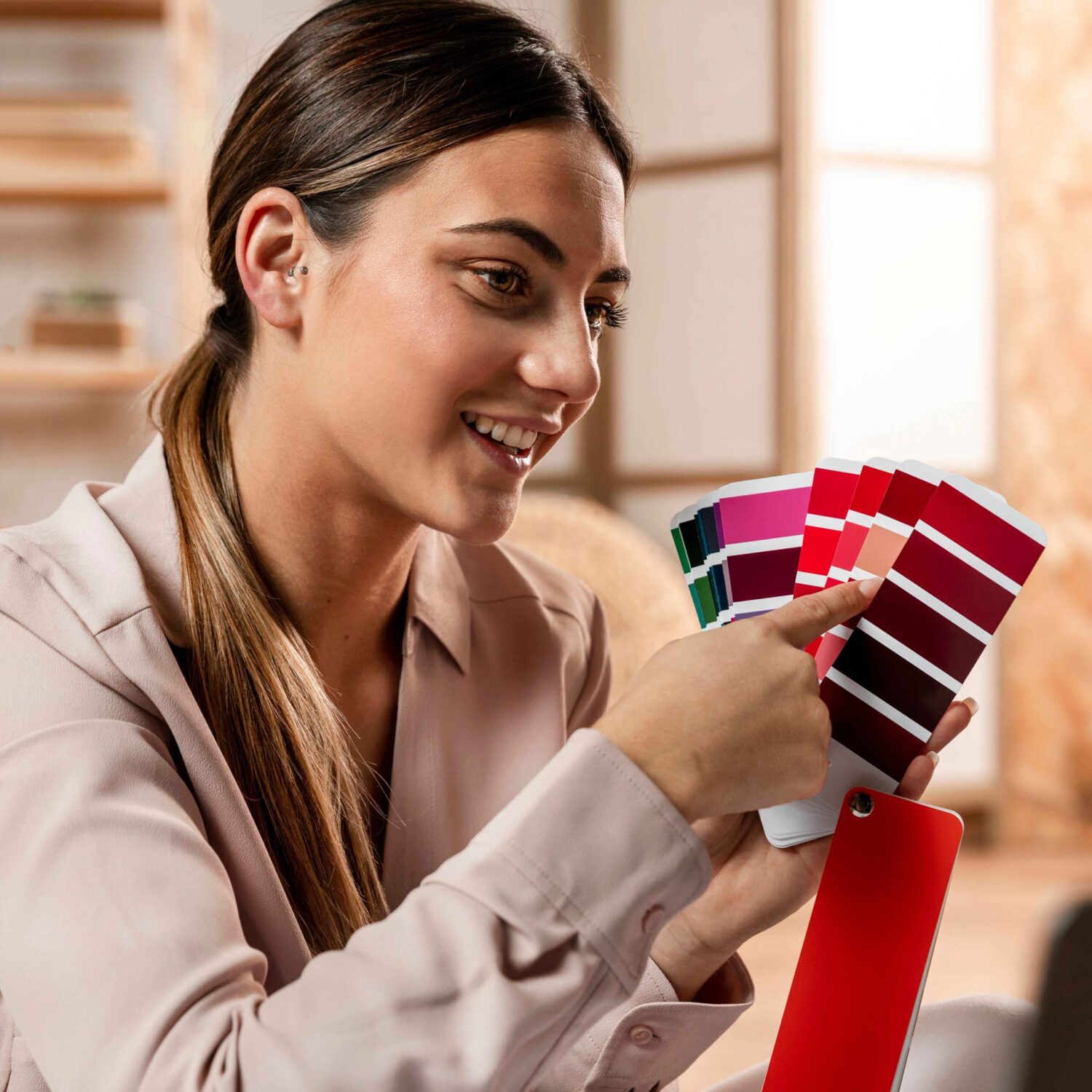
Red color psychology: Energy and Urgency
The color red is associated with energy, passion and urgency. This color can increase the heart rate and blood pressure, evoking intense emotions. In marketing, the red is used to capture the attention and stimulate a rapid response.
Examples of Brands that Used the Red:
Coca-Cola: Use the red to convey energy and enthusiasm, creating a sense of urgency in your sales campaigns.
Netflix: The red in their logo suggests dynamism and emotion, in line with the experience intense and entertaining that offers its platform.
Blue color psychology: Calm and Confidence
The blue communicates calm, confidence, and serenity. It is a color widely used in corporate environments and professionals to project stability and professionalism. In addition, the blue can help reduce anxiety and promote a sense of tranquility.
Examples of Brands that Used the Blue:
IBM: Your logo blue reinforces the confidence and stability, in line with his image as a technology company with strong and reliable.
Facebook: The blue of your interface transmits calmness and confidence, creating a peaceful environment for social interaction.
Green color psychology: Nature and Balance
The green is associated with nature, balance and freshness. In interior design, green is used to promote a relaxing environment and healthy. It may also help the rejuvenation and a feeling of well-being.
Examples of Brands that Used the Green:
Starbucks: The green in their logo symbolizes the freshness and the connection with nature, in line with its image as a company that values sustainability and well-being.
Whole Foods: Use of green to highlight its focus on natural and organic products, appealing to the eco-conscience of your customers.
Yellow color psychology: Happiness and Optimism
The yellow evokes happiness and optimism. However, it should be used with moderation, as too much yellow can cause anxiety. In the graphic design, the yellow is used to attract attention and generate a feeling of joy and energy.
Examples of Brands that Used the Yellow:
Mcdonald’s: The yellow in your logo and design restaurants is meant to attract customers with a feeling of joy and energy, making them feel welcome.
IKEA: Use yellow to highlight special offers and promotions, generating a sense of optimism and urgency in their campaigns.
Appeal to the Emotions of the Consumer
The colors can be used to evoke emotions to specific consumers. By understanding how the colors affect to the motivations and feelings, you can create marketing campaigns more effective and persuasive.
Other Popular Colors
In addition to the above-mentioned colours, there are other colors that also play an important role in the psychology of color:
- Orange: often associated with enthusiasm, creativity and vibrant energy. Brands such as Fanta and Reebok used the orange to capture the attention and fostering a sense of fun and dynamism.
- Purple: Associated with royalty, creativity and luxury. Twitch and Hallmark used the purple to convey sophistication and originality.
- Black: Means elegance, power, and sophistication. Chanel and Nike used the black for projecting an image of luxury and authority.
- White: Associated with purity, simplicity and cleanliness. Apple and Tesla used the white to convey modernity and elegance in their designs.
Professions that use the Psychology of Color
The psychology of color are applied in various industries to take advantage of its emotional impact and perceptual:
Graphic design and Advertising: The graphic designers use color to attract attention, convey messages and encourage action. Colors may affect the perception of a brand, and in the effectiveness of the advertising campaign.
Interior and Architecture: the design of interiors, the colors are selected to create environments that influence the mood and functionality of the spaces. For example, the shades of blue and green are common in work environments to promote concentration and tranquility.
Fashion: In the fashion industry, the color communicates style and personality. Fashion designers choose colors that reflect trends and prevent the design become obsolete quickly.
Branding and Marketing: companies use colors to build a brand identity consistent and to influence purchase decisions. Colors can evoke emotions that are aligned with the values of the brand and the desires of the consumer.
Interaction and Perception
The combination of colours can alter your perception and effectiveness. Use combinations harmonious or contrasting can influence how you feel and reacts to the viewer in front of the design. Experiment with combinations can enhance the visual communication.
Trends in Psychology of Color
Trends in color and their perceptions evolve over time. Be aware of the current trends can help you to design in a way that is relevant and attractive to audiences modern.
Impact on the Usability
Color influences the usability of digital interfaces. Colors are well chosen can improve navigation and user interaction, while elections inappropriate may confuse or frustrate.
Design the psychology of color in mind optimizes the user experience.